


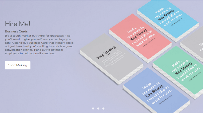
Adios, boring business card designs
Let’s face it, most business cards look the same- horizontal, primary colors, 1993 Glamour shot, alphabet soup, fax number, phone number, website, blog, twitter, facebook, broker, license number, weight, height, etc. I exaggerate, but the point remains that the majority of all business cards are uninspired.
We’ve written on this topic for years and today, we continue by bringing you some eye candy and hopefully inspiration for your own business card upgrade. Think outside of the box!


Which design above is your favorite design? Tell us in the comments below!


Juan Carlos
February 15, 2011 at 4:54 pm
I’m very partial to he designs that incorporate texture. # 12 is pretty cool too
Bob Gorman
February 19, 2011 at 4:10 pm
I liked 10 and 20……..
Mary Hoffman
February 19, 2011 at 2:56 pm
I love the creativity demonstrated.
I really appreciated the sophisticated, classy look of # 13
# 11 the 3 D effect was really inovated
# 10 the I phone look was swell if I really had an I phone but conflicted with my Blackberry – but was indentifible.
Lisa
February 19, 2011 at 9:07 pm
Some very cool designs, but no real estate ideas. What’s up with that? I thought that was the whole point.
Victor
February 20, 2011 at 10:11 pm
I agree with Lisa. I was also looking for some Real Estate designs as I have some large projects with Remax and William Raveis here in CT, and nothing here.
Lani Rosales
February 20, 2011 at 10:31 pm
I hate having to spell this out, but the implication in this and other articles remains that real estate cards are usually horribly ugly and should depart from the standard- Realtor’s face on the right side, a generic house logo on the left and usually printed in primary colors.
Real estate cards DO NOT HAVE TO LOOK all Realtor-y and this article and the several linked to at the end that we have produced are aiming to inspire departure from the boring, lame traditional look that puts real estate professionals in a box. We encourage readers to try something new and model their business cards after the non-real estate examples provided and less like the standard.
Lily Chen
November 17, 2011 at 2:50 pm
Sometimes lame, boring, and traditional just WORK. How of us despise the pushy infomercials and those direct response ads, but when we walk into the store, we go "Hey! Snuggies on sale!" 🙂
MH for Movoto
February 22, 2011 at 7:39 pm
my faves: 3, 8, 14, and 16. love ’em.
Janet Carroll
February 23, 2011 at 6:57 am
2 9 11 and 13. I loved them. Great Creativity!
rosevilleandrocklin
November 17, 2011 at 12:34 pm
A big design PSA before adventuring into a new design or look for your business – it's best to design in Vector art, not Raster images. If you don't know or understand what I mean. I highly recommend you research and know the difference as it can save you a lot of time, heartache and cost when you go to implement your "schnazzy" new design look into other facets of your business.
Lily Chen
November 17, 2011 at 2:45 pm
As a graphic design and real estate professional, I do appreciate the creativity exhibited in these designs. However, practicality and usability must come first for the real estate professional. How many average agents (not broker-owners) have a business card budget of hundreds if not thousands of dollars for some of these special effects? And how many of these cards sport tiny, 5-point type most of us over 30 can't read, or feature blind embossing only a braille reader can decipher? Letterpress? Die-cutting? What about going back to basics and focus on making a connection with people. People may hire designers based on how fancy the cards look, but in real estate, that is just not going to happen.
Debbie Brand
January 1, 2012 at 2:27 am
Love the eye candy and the clean lines. Industry standards for REALTORS require certain information on all advertising including business cards. I've seen some cool ideas with that required info on the backsides.