


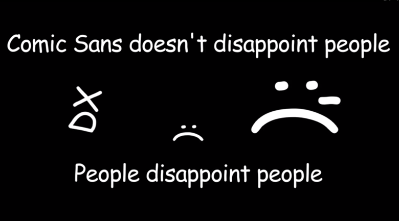
 For those of you out there who drool over new font releases or pick up ad flyers and wonder why the typography is so hideous, or if you barf at the sight of comic sans, this video is for you.
It has swear words, so put on your headphones if you are at work:
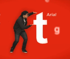
I’m guilty of using Arial at times and I’m guilty of obsessing over how sexy Helvetica is, but now any time I see Arial I’m going to think of a 15 year old goth girl who poops bats.
If you’ve enjoyed this video and have an affinity for typography, we’ve highlighted in the past how fonts enhance your marketing, why text is art and even outlined the top five web fonts to use.
Originally published March 22, 2010.


Ken Montville
March 22, 2010 at 9:38 pm
Absolutely fabulous! I’m going back to helvetica right away. Although I like the new Calibri that seems to be the new MS default font. I [heart] type.
Lori Luza
December 11, 2010 at 10:37 pm
“It’s just sticking. Out there! Why does it do that?”
LOL!
Thanks for the vid!
guilty user of Arial at times,
Lori
Nanette Labastida
December 12, 2010 at 9:35 am
that was awesome! – I’m guilty of not thinking about all this too much but i don’t think i will ever look at an R the same way
Noreen Parrell
December 12, 2010 at 5:34 pm
I Love Fonts – I went to RIT (Printing & Packaging) & here I am selling RE. But I love looking for different fonts for my materials. It’s so easy to download any kind of font you may want. Just google and tons of websites come up!
Ruthmarie Hicks
December 13, 2010 at 2:57 am
Oh God! I’m soooooo guilty… Loved the video & the font history lesson! Had no idea.